- Chronology
- Before 1500 BCE
- 1500 BCE to 500 BCE
- 500 BCE to 500 CE
- Sixth to Tenth Century
- Eleventh to Fourteenth Century
- Fifteenth Century
- Sixteenth Century
- Seventeenth Century
- Eighteenth Century
- Nineteenth Century
- Twentieth Century
- Twenty-first Century
- Geographic Area
- Africa
- Caribbean
- Central America
- Central and North Asia
- East Asia
- North America
- Northern Europe
- Oceania/Australia
- South America
- South Asia/South East Asia
- Southern Europe and Mediterranean
- West Asia
- Subject, Genre, Media, Artistic Practice
- Aesthetics
- African American/African Diaspora
- Ancient Egyptian/Near Eastern Art
- Ancient Greek/Roman Art
- Architectural History/Urbanism/Historic Preservation
- Art Education/Pedagogy/Art Therapy
- Art of the Ancient Americas
- Artistic Practice/Creativity
- Asian American/Asian Diaspora
- Ceramics/Metals/Fiber Arts/Glass
- Colonial and Modern Latin America
- Comparative
- Conceptual Art
- Decorative Arts
- Design History
- Digital Media/New Media/Web-Based Media
- Digital Scholarship/History
- Drawings/Prints/Work on Paper/Artistc Practice
- Fiber Arts and Textiles
- Film/Video/Animation
- Folk Art/Vernacular Art
- Genders/Sexualities/Feminisms
- Graphic/Industrial/Object Design
- Indigenous Peoples
- Installation/Environmental Art
- Islamic Art
- Latinx
- Material Culture
- Multimedia/Intermedia
- Museum Practice/Museum Studies/Curatorial Studies/Arts Administration
- Native American/First Nations
- Painting
- Patronage, Art Collecting
- Performance Art/Performance Studies/Public Practice
- Photography
- Politics/Economics
- Queer/Gay Art
- Race/Ethnicity
- Religion/Cosmology/Spirituality
- Sculpture
- Sound Art
- Survey
- Theory/Historiography/Methodology
- Visual Studies
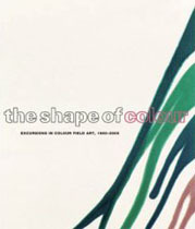
This past summer, the Art Gallery of Ontario (AGO) in Toronto and the Albright-Knox Art Gallery in Buffalo, inspired by the history and legacies of their collections and even the buildings that house them, focused on abstraction—each with a major exhibition and accompanying publication: The Shape of Colour: Excursions in Colour Field Art, 1950–2005 at the AGO and Extreme Abstraction at the Albright-Knox.
Responding to a bemused critic in a statement to the New York Times on June 13, 1943, Adolph Gottlieb and Mark Rothko, assisted by Barnett Newman, declared: “To us art is an adventure into an unknown world, which can be explored only by those willing to take risks.” The AGO’s excursions and the Albright-Knox’s adventures in the extreme embrace this notion of “risk.” At the “Voicing Toronto” conference, held two weeks before the opening of The Shape of Colour, curator David Moos made public his vision for the profile of contemporary arts at the AGO:
I have one word, one concept . . . and it isn’t something that I would dare to put out there had I not investigated and practiced it myself, but the word is “risk” . . . risk frames the limitations, it frames the scope of your ambitions and your expectations . . . at all levels, whether you are an artist working reclusively in your studio or you’re a city in the business of building great cultural institutions. . . . (“Voicing Toronto: The City and the Arts,” University of Toronto Humanities Centre, Live Humanities Lectures, May 15, 2005: Afternoon Panel, digital video recording, http://www.utoronto.ca/humanities-centre/livelectures.html [accessed December 3, 2005])
In his introduction to the accompanying catalogue, Matthew Teitelbaum, director and CEO of the AGO, notes that The Shape of Colour was the “first major exhibition undertaken during Transformation AGO—our Frank Gehry designed expansion, which will reconfigure the museum as the imaginative centre of the city of Toronto” (8). It is indeed a transformation, and any curator might find summer programming risky business under such circumstances; truncated or closed galleries, reduced operating hours, and general chaos are encountered during most major renovations to cultural institutions. The AGO embraces the progress brought on by change, and their choice for adventurous programming is abstraction.
Claire Schneider, associate curator for contemporary art at the Albright-Knox and co-organizer with Louis Grachos of Extreme Abstraction, might agree with Moos’s sentiments. In her essay, “Extreme Needs Abstraction,” Schneider suggests: “In a manner of speaking, one could say that Buffalo’s Albright-Knox Art Gallery is abstraction. Extreme Abstraction celebrates this legacy in a truly contemporary way, by surrendering the entire museum to this great language in a way that reveres the old masters, but takes them out of an historical comfort zone into an arena of experimentation and risk that is the backbone of this great institution” (21).
But when did this idea of risk sublimate from art into the foundations of major galleries? Perhaps a better question is: When did risk become leashed to the promotion of a museum’s image? Frank Lloyd Wright’s Guggenheim Museum in New York comes to mind, and as recently as 1996 it appropriately played host to Mark Rosenthal’s comprehensive exhibition, Abstraction in the Twentieth Century: Total Risk, Freedom, Discipline. Revealingly, Schneider explains the significance of “extreme”: “Extreme has become the word to describe the unusual, extraordinary, daring, out-there. . . . Extreme is the new cool. (Ironically everything must claim to be this, even the most mundane things, so that they will stand out from the seemingly endless amount of stuff out there.)” (17) In post-avant-garde times it seems that coveting the extraordinary has become conventional.
The standardization of abstract art is something that concerned Clement Greenberg. Whether to resurrect or revile him, it is now commonplace to evoke Greenberg in discussions of abstraction, and The Shape of Colour does so in diverse and thoughtful ways. An interview with Moos, cleverly printed on the reverse of the equally unexpected dustcover that opens into a poster, confirms the catalogue’s consciousness of the impact of criticism on Color Field art. The contributors of the catalogue’s major essays, including Moos, Robert Hobbs, Sarah K. Rich, and Mark A. Cheetham, all touch on Greenberg and his role as a protagonist in the history of Color Field art. Admittedly inspired in part by the 1964 Greenberg-led Post Painterly Abstraction exhibition that traveled to the AGO (then known as the Art Gallery of Toronto), The Shape of Colour’s rereading succeeds in bringing the past forward into the future. The exhibition, on the other hand, was hung with historical linearity in mind, thereby isolating the most recent art works from their colorful antecedents. For instance, although Mary Heilmann’s own catalogue entry for her painting in the exhibition indicates her postmodern reflection on the works of Anthony Caro, Jules Olitski, and Kenneth Noland, these artists were displayed in an entirely separate space in the exhibition, far from Heilmann. The best opportunity for visual comparison therefore rests in the pages of the catalogue. Evelina Petrauskas is to be commended on its graphic design, which does not compete with the subjects and allows for easy reading. Unfortunately, though, for an exhibition on color, those in charge of the publication’s color correction should blush. For example, Ellsworth Kelly’s Blue White (1960) reads as blue and grey.
The Shape of Colour catalogue is a good resource for contemporary thoughts on Color Field art, with intentionally varied entries on each work of art in the exhibition. The contributors to the catalogue section are similarly diverse, including artists, historians, critics, and curators (such as the Albright-Knox’s Claire Schneider). Along with Schneider, Helen Frankenthaler’s Tutti-Fruitti (1966) was also moonlighting. The painting was included in both The Shape of Colour and Extreme Abstraction. Frankenthaler is worthy of the attention, and provides, for both projects, a prime example of how abstraction of the past is still potent today. In The Shape of Colour catalogue, this painting represents the freedom afforded to her colors when she switched from oil to acrylic paints in the early 1960s. Other key moments in color experimentation and interpretation are found at the end of The Shape of Colour catalogue in Raphael Rubinstein’s “anthological timeline,” which spans from the nineteen-thirties into the twenty-first century. Highlights of technological innovations in this chronology, such as the launch of Adobe Photoshop, are reminders that even greater leaps in abstraction are still possible today.
Extreme Abstraction also aims to provoke conversations between historical and contemporary works of abstract art, but in a much more forceful manner than The Shape of Colour. Just like the exhibition it celebrates, the Albright-Knox’s publication is a non-chronological and delightfully surprising romp through abstraction. Pae White, one of the nearly one hundred-and-fifty abstractionists included in the exhibition, designed this “artists’ book.” The result is a concentration on the publication’s visual character, and an expectation to be extreme. The book’s layout measures approximately 5.5” by 12” long. The reader must also cope with a barrage of typesetting gimmicks. However, this long format and anachronistic arrangement of images allows for energizing visual comparisons, similar to the exhibition itself.
In keeping with the many mid-century masterworks of the Albright-Knox collection, the effect of the exhibition and its catalogue is an all-overness. The Extreme Abstraction exhibition occupied both the 1905 and 1962 buildings of the Albright-Knox’s complex as well as the surrounding grounds. Foregoing the typical catalogue approach, the pages of Extreme Abstraction illustrate only select works in the exhibition as representative examples. A complete alphabetical list of all artists and their works follows. Beyond this, Grachos contributes a foreword and Schneider an essay. The pages are cut with intriguing photographs of the Albright-Knox’s architectural spaces, consistent with the alignment of the institution with the avant-garde art that it collects. Also remarkable is the smattering of gallery event shots, capturing crowds and peculiar pairings of the Albright-Knox’s patrons over the years. In contrast to the multi-cultural profile of the artists in this exhibition, all the faces in the photographs are white—a monochromatic montage that inadvertently tells another story about the life of abstraction.
The Shape of Colour and Extreme Abstraction are publications that served to accompany major exhibitions that straddled the U.S.-Canadian border last summer. They now remain as successful textual (in the case of The Shape of Colour) and visual (in the case of Extreme Abstraction) testaments to the strength of abstraction in the twentieth century and for years to come. Both publications implied ties between the exhibition’s avant-garde art and the evolution of their respective museums—the Albright-Knox holding a flame for their legacy of risk and the AGO coveting radical change. Overall, The Shape of Colour and Extreme Abstraction are distinct explorations of Color Field and abstract art in general.
Sarah Stanners
Ph.D, candidate, Graduate Department of History of Art, University of Toronto