- Chronology
- Before 1500 BCE
- 1500 BCE to 500 BCE
- 500 BCE to 500 CE
- Sixth to Tenth Century
- Eleventh to Fourteenth Century
- Fifteenth Century
- Sixteenth Century
- Seventeenth Century
- Eighteenth Century
- Nineteenth Century
- Twentieth Century
- Twenty-first Century
- Geographic Area
- Africa
- Caribbean
- Central America
- Central and North Asia
- East Asia
- North America
- Northern Europe
- Oceania/Australia
- South America
- South Asia/South East Asia
- Southern Europe and Mediterranean
- West Asia
- Subject, Genre, Media, Artistic Practice
- Aesthetics
- African American/African Diaspora
- Ancient Egyptian/Near Eastern Art
- Ancient Greek/Roman Art
- Architectural History/Urbanism/Historic Preservation
- Art Education/Pedagogy/Art Therapy
- Art of the Ancient Americas
- Artistic Practice/Creativity
- Asian American/Asian Diaspora
- Ceramics/Metals/Fiber Arts/Glass
- Colonial and Modern Latin America
- Comparative
- Conceptual Art
- Decorative Arts
- Design History
- Digital Media/New Media/Web-Based Media
- Digital Scholarship/History
- Drawings/Prints/Work on Paper/Artistc Practice
- Fiber Arts and Textiles
- Film/Video/Animation
- Folk Art/Vernacular Art
- Genders/Sexualities/Feminisms
- Graphic/Industrial/Object Design
- Indigenous Peoples
- Installation/Environmental Art
- Islamic Art
- Latinx
- Material Culture
- Multimedia/Intermedia
- Museum Practice/Museum Studies/Curatorial Studies/Arts Administration
- Native American/First Nations
- Painting
- Patronage, Art Collecting
- Performance Art/Performance Studies/Public Practice
- Photography
- Politics/Economics
- Queer/Gay Art
- Race/Ethnicity
- Religion/Cosmology/Spirituality
- Sculpture
- Sound Art
- Survey
- Theory/Historiography/Methodology
- Visual Studies
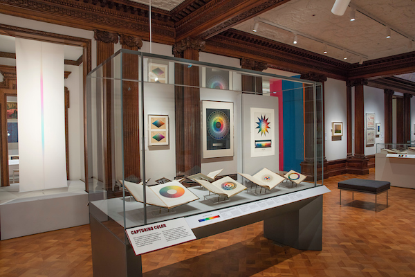
Organized at Cooper Hewitt, Smithsonian Design Museum, by Susan Brown, associate curator of textiles, and Jennifer Cohlman Bracchi, reference librarian, Saturated: The Allure and Science of Color showcased a broad range of objects, predominantly from the Smithsonian Institution’s impressive collections. Beginning with a selection of rare handbooks dating back to as early as the seventeenth century (e.g., Athanasius Kircher’s 1671 Ars Magna Lucis et Umbrae), the exhibition shed light on the long history of attempts to render and fix a definitive taxonomy of the visible spectrum—a sort of visual dictionary, or a guide for the impulses traveling between the eye and the brain via the optic nerve. Considering this focus, it seemed like an unfortunate contradiction that concerns for the conservation of paper necessitated the presentation of books which are startlingly radiant—both in the literal and figurative sense—in dim, darkened rooms.
Even though, regrettably, the volumes assembled for display in the first part of the exhibition were exclusively of European and North American origin, the exhibition exposed their implications as far-reaching, particularly in terms of demonstrating how the qualities of color present a challenge to the firm boundary between art and science. Surprising in their sheer diversity, the books competed for attention through an array of spectacular diagrams plotted onto their pages, as much explanatory as aesthetically conscious in character and thus predisposed to override the written word. Lesser-known publications such as Emily Noyes Vanderpoel’s 1903 Color Problems: A Practical Manual for the Lay Student of Color emerged as wonderful distillations of the way color’s abstract and material qualities intertwine. At once intent on transcribing visual information into objective systems and fully cognizant of the experiential manner in which the chromatic spectrum manifests itself (is color really there if it is not seen?), Vanderpoel’s visual exercise in color blending perfectly exemplifies the multifaceted nature of perception that the rest of the display alluded to. Viewed together, the exhibited tomes quickly began to emphasize the very impossibility of a schism between subjective and objective knowledge: regardless of the authors’ intentions, this concentration of disparate methods through which color had been filtered at various points in its history revealed that at the heart of supposedly involuntary physiological reception is, in fact, mediation.
With the consequences of this rhetorical dilution manifold, the exhibition appeared to provide further questions in place of answers. Encapsulating the complexity of color analysis was Electronics: A New Science for a New World, a trade catalogue produced in 1942 for General Electric by Herbert Bayer, a former Bauhaus student and teacher. The pages selected for display described the spectrophotometer, then a recent invention, as “a magic electronic device that can detect 2,000,000 different shades of color—and produce for permanent records a chart of each color.” It might seem surprising for the word “magic” to appear in a celebration of not just human ingenuity more broadly but technological innovation in the United States specifically; yet what this statement signifies is the continued intertwinement of physics and metaphysics in the study of tonality. Indeed, at the same time that it emphasized technological advancement, the exhibition seemed to hint at the inherently conflicted character of color’s relation to modernity, reminding viewers that the convergence between the fields of art and science remains to this day far from resolved.
Displayed to the right of the trade catalogue were bookplates from Interaction of Color, the well-known 1963 publication compiled by another Bauhaus émigré, Josef Albers. Within this pictorial space, graph paper as a tool for scientific analysis directly intersects with graph paper as a modernist idiom, the emblematic grid. At once reminiscent of technical diagrams and Albers’s painterly studies of chromatic interaction (such as the Homage to the Square series, 1950–76), the showcased colorimetry charts illustrated the correlation between the representational ranges of art and technology. As one of the afterlives of Bauhaus visual experiments, Interaction of Color is undoubtedly a key point of reference; however, although visitors had the opportunity to personally experience the exercises designed by Albers on a tablet placed within the gallery, a contextualization of the debates from which they had evolved—and those which they had betrayed—could have proven more productive. Analogous models, such as Wassily Kandinsky’s investigation into the emotional and psychological effects of color, were sadly neglected.
Color’s more sinister connotations were alluded to in a display at the back of the same room, where the provenance of the Ishihara color blindness test was traced to the Japanese army’s assessment of potential recruits. In the same vein, American military camouflage was identified as a legacy of Abbott Thayer’s studies of animal coloration. Accompanied by an antiwar poster from circa 1980 (“U.S. Out of the Middle East”), in which the effect of thermal imaging is metaphorically deployed to visualize the concealed consequences of military intervention in foreign territories, the display revealed color as a matter of political instead of aesthetic significance. Remarkably, despite the urgency of uncovering such perturbing historical trajectories, this part of the exhibition felt like an afterthought. A more thorough exploration of how color becomes imbued with not just figurative but practical functionality could have shown where its eponymous allure can lead. Color’s instrumentalization in the twentieth century as a tool of control has its own history, from Faber Birren’s belief in increasing worker productivity by means of specific chromatic schemes in the workplace to the claims that “Baker-Miller pink” reduces aggressive behavior, both topics recently explored by Canadian artist Kapwani Kiwanga. Indeed, considering the impact of Birren’s long and prolific career in North America, it seems particularly surprising that the curators made no mention of his many controversial theories.
In a small gallery connecting the exhibition’s two main spaces, a display of Richard Landis’s textiles was presumably intended to act as a contemporary synthesis of the curators’ historical concerns. While the works on show could hardly be described as anything other than beautiful, and the manifest tension between mechanization and handwork is certainly of crucial importance to the wider frictions within the narrative of color (“If the loom is the computer, then Landis is the programmer,” visitors were told), the lack of reference to weaving as a historically gendered artistic practice seemed like another missed opportunity, in particular since one of Anni Albers’s samples was on display just a few steps away. (She famously took up weaving because of the Bauhaus’s patriarchal disciplinary divisions.)
Rather different in character from the bookish introduction, the second room of Saturated, focusing on the use of color in design, looked more like a cohesive environment than a gallery space filled with objects. Comparatively gaudy and busy, it appeared to not only signify but also actively utilize color’s appeal. In doing so, it fell into the trap earlier avoided, namely that of subscribing to, or at least failing to actively challenge, notions of color’s ontological as much as chemical stability. Little could be more indicative of attempts at racial essentialization than the Pantone SkinTone Guide from 2017, included in a display entitled “Color Collaboration.” Though meant to indicate inclusiveness (too often is the color of “flesh” assumed to be a light beige—one only need look at the default shade of Band-Aids, “skin-toned” nude tights, or, as pointed out by artist Alanna Reeves in her zine HUE, consider the significance of “Caucasian Flesh Tone” oil paint), the inclusion of this anthropometric fan deck reinforced the false rhetoric of egalitarian categorization with regard to complexion. Under the guise of objectivity, the scientific measurement of subjects’ characteristics involved in color matching can have—and, historically, has had—a dehumanizing effect. Without any reference to colorism and racism at the time of Black Lives Matter and the reactionary Blue Lives Matter, the audience was left without any tools to reflect on the complex politics of similarity and difference as played out in relation to race and color when one’s position on its (arbitrary) spectrum continues to be a matter of not merely representation, but life and death.
Nearby, the topics of statistics, classification, and navigation were examined through the lens of color-coded atlases, maps, and signs, drawing visitors’ attention to the significance of chromatic conventions in structuring everyday life. However, further scrutinizing color’s role in reinforcing normative behavior, as exemplified by AT&T’s pink Signature Princess Telephone, could have problematized the very theme of “Consumer Choice.” Likewise, the adaptation of William Morris’s designs in ways that betrayed not only his preferred tonal schemes (as the accompanying wall text informed the spectators) but also his socialist ideals had the opportunity to prompt a more critical assessment of the commodities on display, as well as of color itself as commodity, for example in relation to the spread of certain dyes and pigments following colonial conquest. While the exhibition did make the important point that color’s evolution is inherently tied to advancement in technology and manufacture, it did so at the expense of investigating the crucial interplay between its signifying and commercial values.
The subject matter of Saturated no doubt made the exhibition prone to formal connections in place of a rigid historical framework—despite certain colors’ more figuratively saturated past. Color’s captivating qualities might be hard to deny, and reveling in its aesthetic merits is not always undesirable, but I had to remind myself to remain wary of color’s allure, which the exhibition cultivated more than critiqued.
Marta Zboralska
PhD Candidate, Department of History of Art, University College London